商品簡介
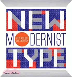
As a book on new typography with a modernist feel, this volume has a strong design message: postmodernism looks like the 1960''s, only cleaner. In fact, when it''s not looking like a Saul Bass title sequence, it often looks a lot like Helvetica. Readers seeking organic looks will not find them here; when the Blob of psychedelia looms, or a Marimekko bird might threaten, the 1920s and 1930''s consistently provide constructivist, dadist, or futurist antidotes. These evoke quite different cultural politics, but all have nice clean edges. For readers whose vision of self-conscious modernism begins and ends with Andy Warhol or 50''s retro kitsch, this book will be an eye-opener. Both editors hail from the School of Visual Arts (NY); Gail Anderson is a former senior art director at Rolling Stone, and Steven Heller is one of the more influential visual designers of our era, with more than a hun